Factfulness – Hans Rosling

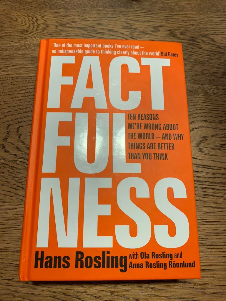
This is data as you have never known it: it is data as therapy. It is understanding as a source of mental peace. Because the world is not as dramatic as it seems. Factfulness, like a healthy diet and regular exercise, can and should become part of your daily life. Start to practice it, and you will be able to replace your overdramatic worldview with a worldview based on facts. You will be able to get the world right without learning it by heart. You will make better decisions, stay alert to real dangers and possibilities, and avoid being constantly stressed about the wrong things.

The central idea of the book is that world is much better than you think and it is getting better. Hans Rosling presents with data how world improved over time and shows with surveys how pessimistic without cause the reader is. While not perfect, the world is indeed getting better and the author presents the pessimistic biases we have.

The book is structured in 10 chapters, presenting an instinct that we must be aware from:

  1. The Gap Instinct
  2. The Negativity Instinct
  3. The Straight Line Instinct Exercise: Question Your Assumptions
  4. The Fear Instinct
  5. The Size Instinct
  6. The Generalization Instinct Exercise: Getting the Full Picture
  7. The Destiny Instinct
  8. The Single Perspective Instinct
  9. The Blame Instinct
  10. The Urgency Instinct

The book was written in the last months of life of Doctor Hans Rosling and seems to encompass his last message to the world: that we should leave bias and look for data, which will help us to create a better world and be more successful in medicine, business and development.

The book is thoroughly entertaining, full of imagines and survey questions that make the read a pleasure. It challenges the reader to rethink the world around. What is really the masterstroke is presenting data in a way that is easy to understand and delivers a clear message.

One of the most thought-provoking, well-written books on the world and developing trends currently on the shelves.

The Visual Display of Quantitative Information – Edward R. Tufte

Graphical excellence is that which gives to the viewer the greatest number of ideas in the shortest time with the least ink in the smallest space.

This book is a classic of how to design a good graphic. It contains some of the most inspirational graphics ever seen and Tufte puts the basis of what makes informational design beautiful and practical.

The content is mostly graphs and charts from the 1970s (even though the second edition is from 2001), which contain the main ideas of a good or a bad chart, but more contemporary design would have been more entertaining.

Undoubtedly, the book is useful in teaching to avoid bad graphic design pitfalls, but it often looks at it would need an update.

The designs presented are elegant and powerful, but sometimes forget about the new displays of space, fonts, colours, images, movement.

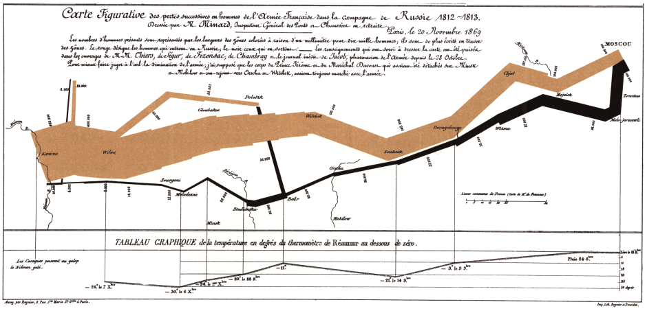
I was impressed by the simplicity and power of some charts made in the 18th and 19th century, by pencil and rule. They expressed ideas so strongly, only using good use of images, numbers and space.

A good design cannot supplement bad information, but a good design can made good information, memorable.

100 Tricks to Appear Smart in Meetings: How to Get By Without Even Trying – Sarah Cooper

2. Translate percentage metrics into fractions

If someone says “About 25% of all users click on this button,” quickly chime in with, “So about 1 in 4,” and make a note of it. Everyone will nod their head in agreement, secretly impressed and envious of your quick math skills.

3. Encourage everyone to “take a step back”

There comes a point in most meetings where everyone is chiming in, except you. Opinions and data and milestones are being thrown around and you don’t know your CTA from your OTA. This is a great point to go, “Guys, guys, guys, can we take a step back here?” Everyone will turn their heads toward you, amazed at your ability to silence the fray. Follow it up with a quick, “What problem are we really trying to solve?” and, boom! You’ve bought yourself another hour of looking smart.

The book presents a sarcastic view of how to act during meetings, including 100 advises of how to look smarter, while not having a clue of what the discussion is about. The funny thing is that it resembles so much the modern world.

Some of the advises include:

1. Draw a Venn diagram. …

2. Translate percentage metrics into fractions. …

3. Encourage everyone to “take a step back” …

4. Nod continuously while pretending to take notes. …

5. Repeat the last thing the engineer said, but very very slowly. …

6. Ask “Will this scale?” …

7. Pace around the room. …

8. Ask the presenter to go back a slide.

The author, Sarah Cooper, is a comedian that worked for companies like Yahoo! and Google and has a blog called The Cooper Review.

When I started reading the book, I genuinely thought that it is some self-development book. Well, it is mostly a humorous take of corporate meetings, but, as the motto says, “It is funny because it’s true!”.

50 Successful Ivy League Application Essays – Gen Tanabe, Kelly Tanabe

“IT APPEARS ALL YOUR CELLS ARE DEAD.”
Only shock prevented the tears from streaming down my face. My cells were dead. After being accepted into the competitive Stanford Institutes of Medicine Summer research Program (SIMR), and spending approximately 170 hours of the past month manipulating human embryonic stem cells (hESCs), I was back to square one—with only one month of my internship remaining. How in the world was I going to make up for lost time?

This is a book presenting, as the title says, 50 essays that made the applicant being accepted at some of the top universities in the world, with fierce competition. After each essay, the evaluators’ comments are included.

The essays were absolutely fabulous. It was a pleasure to read life stories and motivations condensed in only 1 page. While still young and lacking a certain complexity of vocabulary (we are talking about 18-year olds!), the perfect organisation of information, of the message, of presenting someone in the best light, was amazing.

I was particularly impressed by the title of some stories, such as Puzzle and Science Sparks, which made the reader interested and wanting to explore the text. There are so many beautiful turn of phrases, motivations and development stories that it is simply inspirational to discover them.

The book has also 26 solid advices on writing, which can apply to everyone holding a pen or using a keyboard.

Overall, a beautiful and inspirational read.

How to Win Friends and Influence People – Dale Carnegie

It isn’t what you have or who you are or where you are or what you are doing that makes you happy or unhappy. It is what you think about it.

Hands down, this is one of the best motivational books I have ever read: practical and full of wisdom gems. It is basically a self-development book which tries to teach the reader to be a better person with others, with pragmatic advance, encouragements and a positive attitude.

A very positive, helpful book, easy to read even for those who don’t like reading.

Written in 1936, the book is a classic, almost 80 years in print, a testament of its solid advice, timelessness, deep thinking and overall, just common sense. It feels like it was written last year.

It is true that the book is addressed foremost to a readership looking for improving speaking for sales and building self-confidence. However, it does not teach duplicity nor underhandedness. It looks a bit cheesy and superficial indeed, but that makes it easy to read, re-read and motivate for every reader, even the ones that don’t like reading.

The author, Dale Carnegie, had several selling jobs, quite successful, before trying teaching public speaking, which made him rich. He wrote several other books, but this one is the most famous.

From a political philosophy viewpoint, it presents the classical liberal argument that rationally helping others, you help yourself. In essence, even forgetting empathy, we help others for a virtual social safety net. A human being doesn’t need to be nice, it just need to be rational, in order to be kind, attentive to others, helpful and polite.

To conclude, this is an easy-to-read book with timeless advice for those who look for a better self and a better place in society. A short book that I recommend wholeheartedly.

[Featured image by BK, Flickr]

How to Lie with Statistics – Darrell Huff

Extrapolations are useful, particularly in that form of soothsaying called forecasting trends. But in looking at the figures or charts made from them, it is necessary to remember one thing constantly: The trend-to-now may be a fact, but the future trend represents no more than an educated guess. Implicit in it is “everything else being equal” and “present trends continuing.” And somehow everything else refuses to remain equal, else life would be dull indeed.

The book gives straightforward examples of how statistics may be used to deceive. Although written in 1954, it is actual and relevant. The writing is fluid and can be simply understood even from some who is not astute in mathematics.

Manual for critical thinking.

Each chapter presents a particular twist of facts through statistics, usually taking an example from a journal or an advert. Because it is assumed that people give more credibility to facts presented through figures (the more precise, the better), those figures are used to mislead and misinterpret what is really happening.

To mention just a few twists: sample biases (for example a conservative magazine asking readers who they think will win the presidency); inadequate sampling (only 3 or 9 cases); difference between mean and median (the block of apartments might have a different average salary if a very rich man moves in; this doesn’t mean you are richer, but the average goes up); statistical differences lower than than the statistical error presented as relevant differences (such as IQ tests); graphs with no axis measurements; small differences made great through graph manipulations; infographic manipulations (when the difference is, let’s say x2, but the two objects compared in the infographic have surfaces presented at square (x4)); semi-attached figures (when you prove a fact and associate a second one to the first, letting the second fact subtly draw its veracity from the proof of the first); difference between forecast and extrapolation; and many others.

Overall, this little book from Darell Huff is a great defense technique manual for a critical thinker and it is a particular good recommendation for honest journalists, wanting to get the facts from press releases.

Intelligent Research Design – Bob Hancké

The single-most relevant piece of advice, though, is to think carefully who you are writing for. Many, possibly most, research students write just for their supervisor. That is a big mistake: yes, you need to convince him or her of the important of what you are doing, but they are not the ultimate yardstick – and it’s too bad for them if they don’t know that. you should really have a broader, mostly sympathetic, audience in mind when you write, and should probably also diversify your imaginary audience a bit.

Although a book and not an article, I add this post in the Energy section, because it is more related to studies than reading.

Intelligent Research Design is a book offering advice for doctoral researchers at the beginning of their research. While short, the material is condensed and it takes a while to digest. Bob Hancké offers a guide to construct a thesis, from the research question to research design, methodology and presentation.

intelligent-market-design
Learning to construct science

The writing is easy to follow, although the material covered is difficult. It teaches the reader how science is created, the benchmarks of an academic paper and the questions we should ask when reading an article, revealing the potential gaps.

Bob Hancké  is Reader in European Political Economy at the London School of Economics and Political Science and he draws for his decades of teaching experience and grading to show how a good academic paper should look like.

I enjoyed reading the book and I could easily see the points that Hancké wanted to make. I would have liked to recommend the book to my younger me, writing the Masters dissertation.

Presentation Thinking and Design – Ed Gruwez

It is also important to remember the principles of the working memory:

  • Ask for, and hold, your audience’s attention.
  • Make your message easy to understand by limiting its cognitive load.
  • Fix your message in your audience’s mind through repetition, stories and the use of sensory detail. (Presentation thinking and design)

How many times you cursed your days and the speaker for the most insipid, unreadable and tedious presentation that has ever seen the light of a projector?

There are so many tips floating around, just at the fingertips of an Internet research. Why do people do not read them, even the top 5?

Presentation design
Book cover, the inside full of notes

Ed Gruwez shows the basics of creating interesting and memorable presentations. While nothing the author presents is totally new, he puts forward a clear structure, where indeed, the message and the inner logic of the presentation is more important than the fluffy part.

The book comes also with a sum of examples and tips that help create better presentations, quicker. For example, would you delete a slide you worked for2 hours, despite the fact that brings only unrelated information? This is why is better to put the outline of the presentation first on paper, rather than jumping on creating the slides.

Ed (Edouard) Gruwez specializes in presentation thinking and design, and works as Managing Director of “Ogilvy Internal Communications”.

If you know you will do presentations in your lifetime, where you have to deliver a message, this book is helpful. It is easy to read and follow, and you can learn something useful after browsing it for only two minutes.